
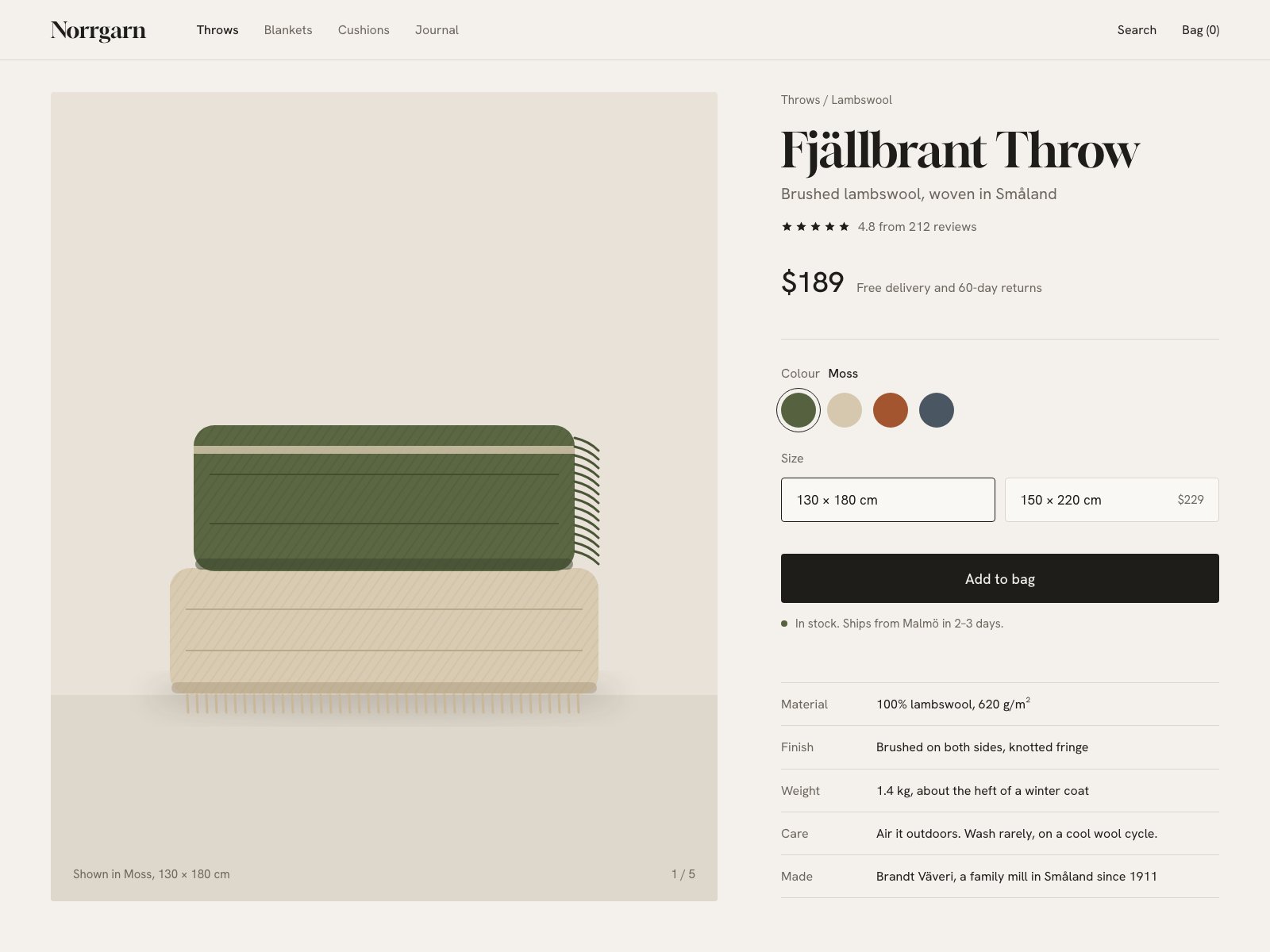
A quiet two-column product page: one dark primary action, choices shown as labelled swatches and sizes, and the facts a wool buyer checks (weight, care, where it's woven) set as a plain spec list.
Assured, well-mannered product page with real copy voice; the flat vector throw undersells a product that lives on texture.
Craft checks
- ContrastFlag. Breadcrumb 'Throws / Lambswool', spec labels (Material, Finish, Weight) and the image caption 'Shown in Moss, 130 × 180 cm' are mid-gray on warm off-white; readable but near the low end at ~13px.
- AlignmentPass. Breadcrumb, title, subtitle, price, swatches, size boxes, CTA and spec table all share one left edge at x≈984; image and logo share the x=64 margin; CTA and spec rules end flush at x≈1536 with the nav's 'Bag (0)'.
- SpacingFlag. Gap between the in-stock line and the spec table (~75px) is noticeably looser than the rhythm above; spec rows vary slightly (Material row reads taller due to the superscript).
- HierarchyPass. Serif title 'Fjällbrant Throw' leads, then $189, then the black full-width 'Add to bag'; supporting info recedes into gray and the table.
- ConsistencyFlag. Size boxes and CTA use near-square ~2px radii while the illustrated throws have large rounded corners and the image panel is square-cornered; the unselected size box's border is so faint it reads almost disabled next to the selected one.
- LegibilityPass. Sans body at ~15px is clean; the '$229' price inside the second size box is small but clear; star glyphs are crisp.
Rubric
Tight high-contrast display serif for wordmark and title against a geometric grotesk; restrained two-family system with few sizes. Price in sans is slightly generic next to the serif title.
Warm oatmeal ground, near-black CTA, and swatches (moss, oat, rust, slate) that double as the brand palette; the green in-stock dot echoes Moss.
Classic half-and-half PDP with a disciplined right column and a spec table that turns specs into storytelling; large image well balanced against dense text.
The stacked-throw vector is tidy, with fringe and diagonal hatch, but it's flat and toy-like; for a textile sold on hand-feel, it communicates neither brushed nap nor weight, and sits small inside a huge empty panel.
Thoughtful details: 'Colour Moss' label update, 1/5 counter, caption naming the shown variant, superscript g/m², Bag (0). Minor looseness below stock line.
Judgment
What works
- Spec table written in human voice turns a data grid into brand storytelling while keeping a clean label/value column.
- Rigorous shared left edge and right edge through the entire purchase column gives the page composure.
- Palette derived from the product's own colourways, so swatches, stock dot and ground feel of a piece.
Replace the flat vector with a close-cropped, softly lit photograph (or richly textured render) of the folded throw that fills the panel and shows the brushed nap and fringe.
Where tasteful people would disagree
Some would say the black CTA and conventional split layout are exactly right for conversion and trust; others would call it the Aesop/Kinfolk template by now and want one bolder move—an oversized image, an asymmetric grid, or a coloured CTA tied to the selected swatch.
Judged live by anthropic/claude-opus-5.5 in 20.1s.