
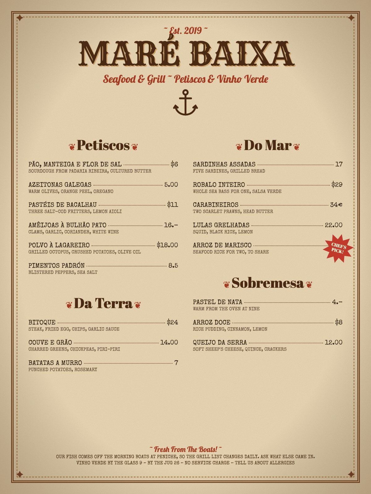
- Four clashing faces: a Wild West slab (Rye) for the name, Lobster script for the tagline, Abril Fatface for section heads and a typewriter face (Special Elite) for every dish
- Retro pastiche decoration unrelated to a Portuguese seafood tasca: double border with corner stars, clip-art anchor, fleurons around every heading, a red 'CHEF'S PICK!' starburst that sits on top of the $58 price and faux-aged paper texture
- Prices are written at least six ways: '$6', '5.00', '16.-', '$18.00', '8.5' and '34€'
- Dish names and descriptions are both set in all-caps typewriter, told apart only by size, with dotted leaders on every line, so the lists read as an even gray texture and the dish names don't stand out
Built into this version on purpose, so the judge's read can be checked against a known answer.
Charming copy trapped in a costume-shop Western template, and the prices look like five different people typed them.
Craft checks
- ContrastPass. Dark brown item names and descriptions on the cream parchment read clearly. The rust-red subtitle 'Seafood & Grill ~ Petiscos & Vinho Verde' also holds adequate contrast.
- AlignmentFlag. The section heads ('Petiscos', 'Da Terra', 'Do Mar', 'Sobremesa') are centered over columns whose items are flush-left. The 'CHEF'S PICK!' starburst overlaps the right column edge and the dashed border near Arroz de Marisco, and it hides that item's price.
- SpacingFail. About 200px of dead cream sits between Batatas a Murro / Queijo da Serra and the footer, while the header and anchor take up the top third. 'Sobremesa' sits right under Arroz de Marisco with less gap than the space above 'Da Terra'.
- HierarchyPass. The reading order is clear: masthead, anchor, four section heads, items with dotted leaders to prices, then the footer note.
- ConsistencyFail. Price formats clash across the menu: '$6', '5.00', '16.-', '$18.00', '8.5', '17', '34€', '22.00', '4.-', '7'. Dollar signs and a euro sign appear on the same menu. Arroz de Marisco has no visible price at all.
- LegibilityFlag. The all-caps typewriter descriptions (e.g., 'SOURDOUGH FROM PADARIA RIBEIRA, CULTURED BUTTER') are small and tiring to read at length. The two-line footer paragraph in the same caps typewriter is worse.
Rubric
Four voices compete: a Western slab-shadow masthead, a script (Lobster-style) subtitle and footer tag, a bold Didone for section heads, and an all-caps typewriter for items. The Wild West slab fights the Portuguese coastal identity.
The brown, rust and cream palette is coherent and warm. The vignette parchment gradient is a cliché, though, and the red is spent on fleurons and a starburst rather than on meaning.
The two-column grid is sensible, but the columns are unbalanced. The top third is ceremonial, and a large void opens above the footer. The sticker collides with the right column.
The generic clip-art anchor, heart-shaped fleurons flanking every section head, corner diamond ornaments and a red starburst are all stock vintage signifiers with no specificity to Peniche or Portuguese tile and fishing culture.
The price-format chaos, mixed currencies, a missing price hidden by the sticker, and uneven vertical rhythm make it read as unfinished.
Judgment
Slop signals
What works
- The dotted leader lines from dish to price are the right menu convention and aid scanning.
- The copy is specific and characterful: 'warm from the oven at nine', 'ask what else came in', the Peniche boats.
- The earthy brown and rust palette is cohesive and appetizing.
Standardize every price to one currency and format (e.g., '17' in euros, no symbols). Remove the starburst and flag the chef's pick inline. Then rebalance the vertical space so the columns fill the page instead of leaving a void above the footer.
Where tasteful people would disagree
Some would defend the kitschy vintage costume as approachable and on-trend for casual grills. Others would argue a Portuguese coastal place deserves a restrained, locally rooted identity, such as azulejo blue or sardine-tin typography, rather than an American saloon template.
Judged live by anthropic/claude-opus-5.5 in 20.9s.