
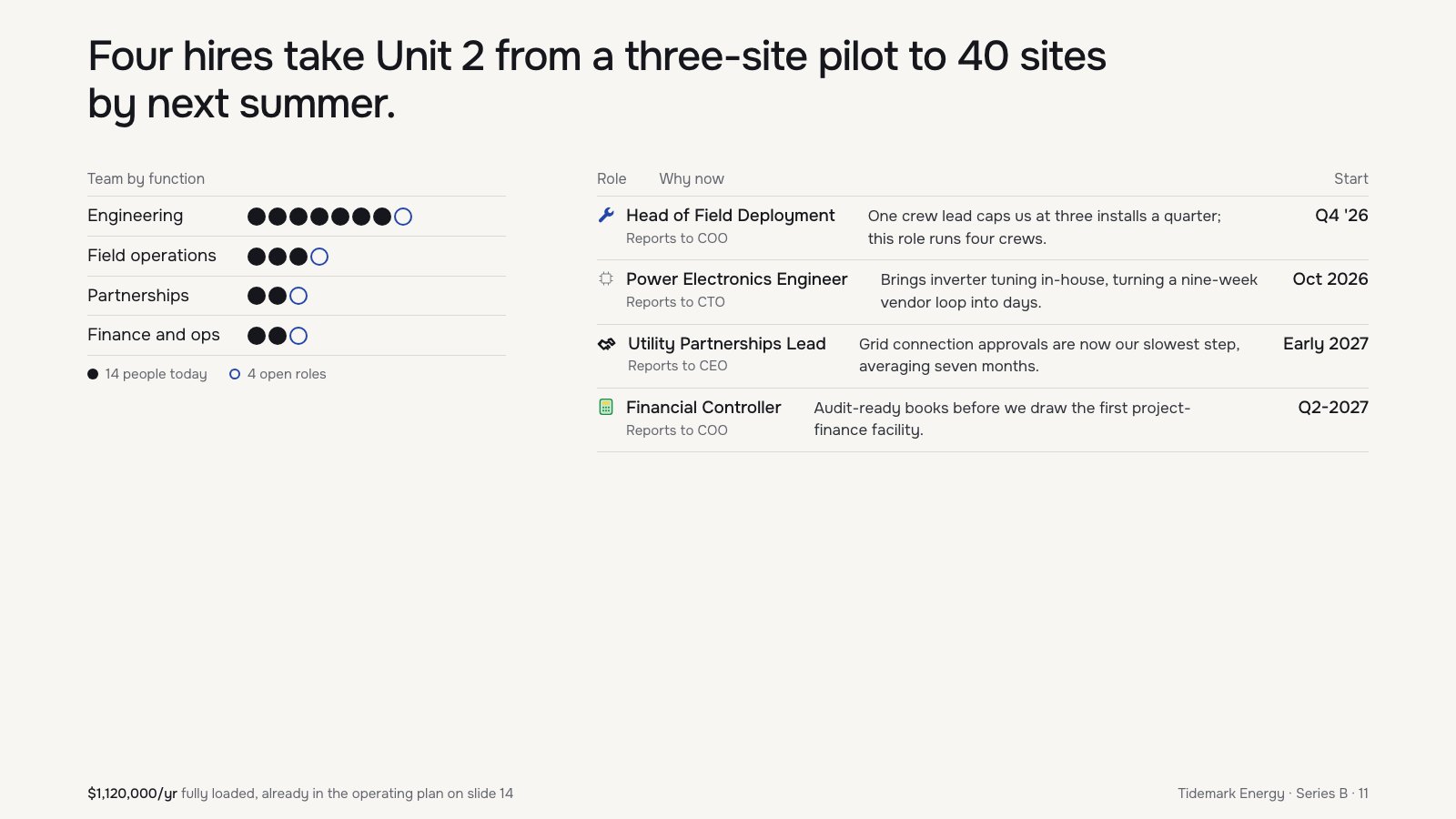
- Each role has an icon from a different set: a solid filled wrench, a thin 1px outline chip, a heavy rounded outline handshake and a two-tone green and yellow calculator
- Table rows size their columns to their content, so the 'Why now' text starts at a different x in each row and none of them line up with the 'Why now' header
- Cramped vertical spacing: 10px row padding, 3px gaps between team dots, the headline 36px from the top edge and the footer 18px from the bottom, while a band of empty space opens up under the table
- Start dates and cost use mixed formats: 'Q4 '26', 'Oct 2026', 'Early 2027', 'Q2-2027' and '$1,120,000/yr'
Built into this version on purpose, so the judge's read can be checked against a known answer.
The headline and dot chart are investor-grade, but the hiring table is sloppy: drifting columns, four date formats, and mismatched icons.
Craft checks
- ContrastPass. Near-black text on warm off-white reads cleanly; the gray 'Reports to COO/CTO/CEO' sublines and 'Team by function' header are light but still legible at this size.
- AlignmentFail. The 'Why now' text starts at a different x in every row: about 954px (Field Deployment), 968px (Power Electronics), 944px (Utility), and 894px (Financial Controller). None align with the 'Why now' header at about 724px. 'Utility Partnerships Lead' also sits about 2px right of the other role titles.
- SpacingFlag. Row rhythm and rules are even in both tables, but everything stops at y≈500. The lower 45% of the slide is empty, and the footer floats far below the content.
- HierarchyPass. The reading order is clear: the large two-line claim, then the left team chart, then the right hires table, then the cost footnote with '$1,120,000/yr' bolded as the key figure.
- ConsistencyFail. Start dates use four formats: 'Q4 '26', 'Oct 2026', 'Early 2027', 'Q2-2027'. Row icons mix styles too: a solid blue wrench, a thin gray outline chip, a bold black handshake, and a green filled calculator that reads like an emoji.
- LegibilityPass. Body copy in the table is about 16px and role titles about 18px, both readable when projected. Footer text at about 14px is small but fine for metadata.
Rubric
The single geometric-humanist sans is used with restraint: a big confident headline, clear title/subline pairing, and a bold figure in the footnote. The 'project-' hyphen break in the Financial Controller row is a small blemish.
The near-monochrome palette with blue reserved for open roles is smart and ties the chart to the legend. The green calculator and blue wrench icons break that discipline.
The two-column split is logical, but the table's middle column has no fixed left edge, and the whole content block sits in the top half, leaving a dead lower field.
The dot chart is an excellent device: 14 filled plus 4 open circles makes headcount and the new hires legible at a glance. The row icons feel pulled from different sets and add nothing.
Good bones undone by uncorrected details: column drift, inconsistent date formats, and a mixed icon set are exactly what a final pass should catch.
Judgment
Slop signals
What works
- The headline is a real claim with numbers (three sites to 40, four hires, by next summer) rather than a topic label like 'Hiring Plan'.
- The dot-per-person chart with open circles for open roles is honest, scannable, and ties directly to the four table rows.
- The footer defuses the cost question by citing '$1,120,000/yr' and pointing to slide 14.
Lock the hires table to a fixed grid: one left edge for 'Why now' text aligned to its header, and one date format (e.g., 'Q4 2026'). Drop the icons or redraw them as one monoline set.
Where tasteful people would disagree
Some would enlarge the content or add a timeline to fill the empty lower half. Others would argue the white space gives a dense argument room to breathe and the footer's anchoring is intentional. Some would also cut the 'Reports to' lines as org-chart noise for investors, while others see them as proof the plan is thought through.
Judged live by anthropic/claude-opus-5.5 in 23.2s.